
When CMS issued its requirement for payers to publish Provider Directory APIs, it contemplated use cases such as in-network provider search and health plan shopping. Consumers shopping for health plans want to check whether their preferred providers are in-network, but they are also likely interested in the robustness of the network. Carriers may lever up and down the monthly premium based on network size (among other factors). Savvy consumers may want to maximize their provider network access relative to the cost. Beyond generic descriptions, metal plan labels, and searching for individual providers, there aren’t easy ways for consumers to compare plan network size.
Health plans are regulated by CMS and are subject to network adequacy requirements that include time/distance standards, minimum number of providers (ratio of specific types of providers to beneficiaries), and appointment wait times. Starting in 2017, CMS ran a pilot in Maine, Tennessee, and Texas for qualified health plans (QHPs) on Healthcare.gov. If you are a consumer shopping for health plans, you see an indicator for every health plan that describes whether a member would have smaller, greater, or about the same access to hospitals, PCPs, or Pediatricians than the average plan in the area.
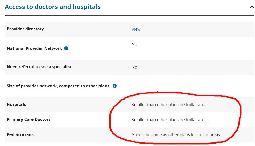
The network transparency indicators are calculated by taking the total number of providers (i.e., hospitals, PCPs, or pediatricians) in the vicinity who accept any QHP plan and calculate the average number of providers per plan. Then, assess the total number of providers that are covered by the target plan, and compare whether the target plan is greater than, smaller than, or about the same as the average plan in the vicinity. This isn’t available for all states yet on Healthcare.gov, and it doesn’t look like CMS’s Medicare shopping tool has a similar feature yet. Some third-party consumers web sites that focus on plan shopping have calculated and made available similar metrics.
We wanted to see if we could leverage the data from carriers’ Provider Directory APIs to perform similar comparisons and see how plans within Miami-Dade County in Florida compared to the average plan based on their access to Primary Care Providers. We followed the same recipe above for the 26 carriers whose Provider Directory APIs we have integrated with. We used a subset of physician taxonomy codes that typically map to Primary Care Providers, queried the total number who accept any plan within Miami-Dade zip codes (2889), calculated the average PCPs per plan (464) and then queried the number who accept specific plans. We then graphed (see below) the plans by the total PCPs they could count in-network.
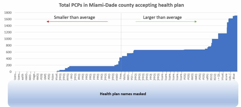
Based on the data, we observe that over 64% of health plans available have fewer than 25% of PCPs within Miami-Dade County. Only 16% of health plans available have greater than 50% of PCPs accepting insurance. Consumers should exercise diligence before selecting a plan, making sure their preferred providers are in-network, and that the network is robust.
Data from Provider Directory APIs can be used to calculate these types of indicators for consumer-facing health plan shopping web sites and other health plan selection tools. Custom metrics can be conceived to calculate network transparency for other specialties, for providers who focus on specific conditions, and perhaps even covered providers who speak a specific language. Access to network data, and the ability to splice and dice it along the factors most important to a patient make it possible to describe the robustness of a network in terms that are most important to the patient.